
The dark side
Beneath the Surface: Exposing the Tactics of Dark Patterns
What are dark patterns?
Dark patterns are design techniques intentionally employed by designers to manipulate users into actions they may not ordinarily choose to perform. These patterns exploit psychological vulnerabilities, utilising deceptive or misleading tactics to steer users towards specific outcomes.
Dark patterns could lead to frustration, confusion, and a sense of betrayal amongst users. Ultimately, continued exposure to the consequences of dark patterns reflect negatively on the brand, eroding its equity with time. But, contribution to the bottom line far outweighs ethical consideration.
Understanding dark patterns is crucial for both consumers and designers to foster ethical and transparent digital experiences.
Deceptions: Ride-hailing apps
Ever wonder why there is always an abundance of ride-hailing drivers in close proximity to you just before booking a ride? The illusion being created is that a rider’s chances of securing a ride quickly are statistically significant and only a click away. While the development team assumes the implementation ensures conversion with very little downside, reality is not something you can mask for long.

Another hidden agenda when resorting to such tactics, is the existence of competition in the market. Riders aren’t always exclusive in their relationship with ride-hailing apps. In fact, the relationship is circumstantial and self-serving. Riders could just as easily open a competing app and secure a ride at the expense of the former.
Unfortunately for the rider, the development teams seem to like each others work to the point that they incorporate similar design decisions. The mantra in effect being - trap a rider by any means necessary.
A natural consequence of this experience is a strong sense of betrayal and depleted trust. Users learn to be skeptical, seeing through false promises which eventually leads to shared experiences among the scared. At the end of the day, the accumulation of negative vibes only reduces a brand’s equity, a situation it will be hard pressed to recover from.
Baiting: Flight booking apps
Airline booking websites and apps are notorious for dark patterns. One common strategy is drip pricing, where travel companies initially present an attractive low fare luring potential travellers into erroneously assuming a price point is indicative of what they will ultimately pay.
Hidden costs like taxes and surcharges can significantly inflate the over all price and these are often revealed later in the booking process. Still some players shamelessly add extra charges at the time of checkout with no obvious indication of what they account for.
Some websites and apps obscure crucial information, like terms and conditions of a fare, making it difficult for users to access vital information until deeper into the funnel. This tactic misleads users into committing a purchase without fully understanding the terms of purchase.
Additionally, cryptic labels like ‘partially refundable’ or ‘cancellation charges apply’, offer little affordance to explain what they entail. Such details are often nested within comprehensive documentation, knowing that most users rarely bother to seek them out.

Finally, it seems unfair that every seat comes with a price tag. Seat selection itself raises the total cost drastically over the initial fare. Imagine being on connecting flights and having to pay for a seat on each segment.
When you combine all these dark patterns into a user’s context where multiple flights and airlines are simultaneously presented, as they are on aggregator platforms, businesses capitalise on user vulnerabilities like memory recall, cognitive overload, and impatience to sneak these deals through.
Creepy times: Food delivery apps
Imagine designers and product managers sitting across a table with their engineering counterparts saying, “Hey! can you guys slow down time so that users think they’re getting their orders on schedule?” . Yes! this actually happens.
It stands to reason that users do not have a clock on their walls, they do not refer to device times, and, most importantly, users are naive to unconditionally trust the progress bar in the app.
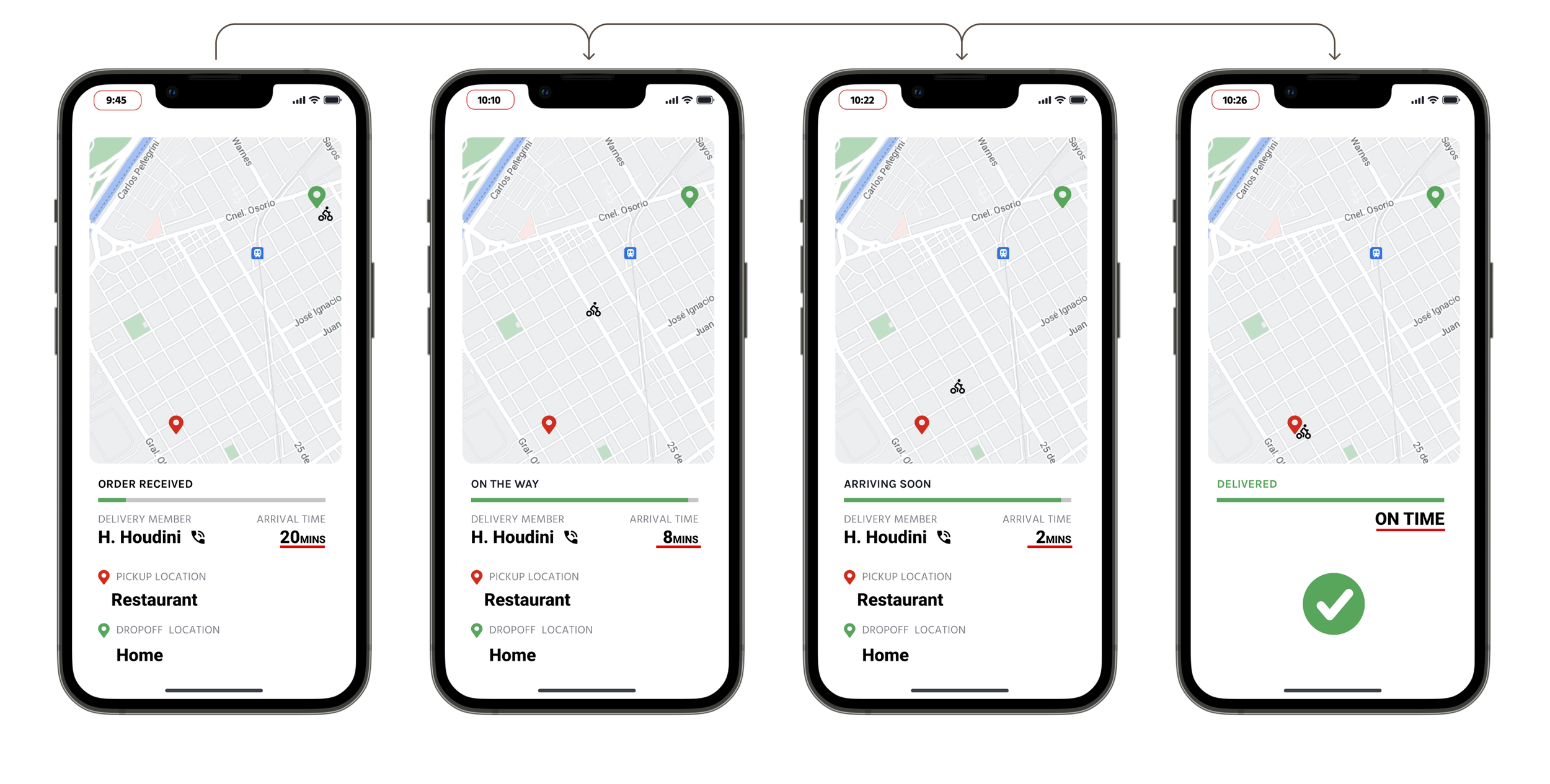
The tactic employed here is to create a sense of speed and progress towards addressing a user’s need. The illusion that ordering a meal via my app is quicker than the competition with an equally compelling value proposition. Unfortunately for the user, the competition too supports this line of thinking, building their very own version of the hacked timer.
Ultimately, users simply learn to discount the placebo and simply not read too much into it, product teams feel they accomplished something great, and app owners erroneously assume they are one up on the competition.
Speed bumps: Ride-hailing apps
Many apps use dark patterns to prevent a reversal of user commitment. This could vary from mild delays to action blockers, prolonged inconveniences to difficult cancellation paths. Let’s have look at mild delays for now. Ever tried to cancel a ride because it was taking too long to find one?
Most users simply cancel a search and try again, the equivalent of a refresh when something isn’t going quite right. App developers are far too aware of this human phenomenon. And while booking a ride is a click away, cancelling it isn’t as straightforward as you’d think.
Notice how the reasons for cancellation are switched in each time you enter the cancellation path. This buys the app more time, even if it is for a few seconds to find you a ride and prevent deflection to a competing application. Also, notice a subtle trick. Most of the options available assign error to the user? And who wants to take the blame for something that isn’t their fault, right? Again, more time bought.

‘People like me’: Online shopping
Ever peruse a product listing on a shopping platform only to get a notification that 51 other people are watching this exact item right now? Or maybe 5 people bought this in the last hour? Or Hurry! Only 4 left in stock? These are usually dark patterns at play. How do you even know it’s true? The intent is persuasion.
The first example is used to create affiliation, consensus, or credibility. ‘People like me’ or ‘Other people’ find this particular item interesting. Therefore, it must be worthwhile. The second example builds on this. The herd is going in. It adds confirmation. The last is simply meant to create a fear of missing out - FOMO.
Shopping platforms could use these patterns in isolated instances or in conjunction to nudge users into committing an action, sort of tipping them over the decision-making edge. It’s also not uncommon to see this dark pattern being utilised elsewhere, reservation or booking platforms for instance.
