
Luigi’s

Designing a mobile application for a family-owned coffee shop
Introduction
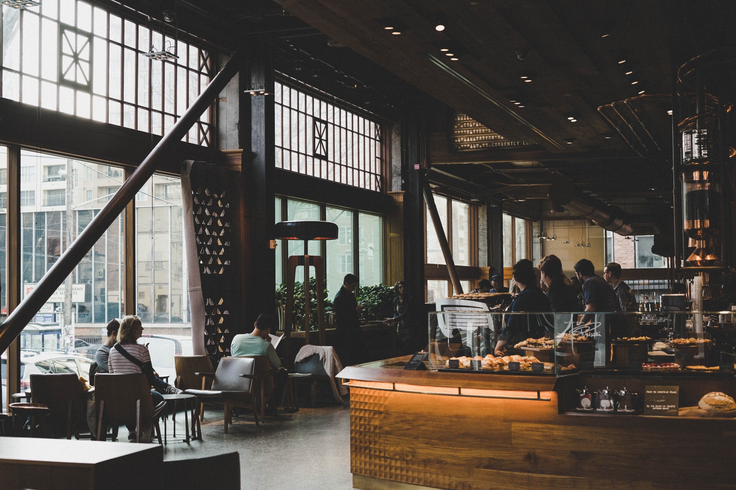
Luigi’s coffee shop is located in Woodside, a serene little neighbourhood in Cupertino. The area has witnessed an influx of techies and college students over the past year because of its proximity to new developed technology parks and college campuses in the area.
Luigi’s has always been a traditionally managed family-business and enjoys a loyal following nurtured over the years. It’s distinctive ambience, service, and menu have made it truly unique. It is now run by Luigi’s three children - Marco, Giovani, and Valentina.
The current owners are concerned about the future. They have witnessed a growing number of competing coffee shops in and around Woodside leveraging digital services that have found resonance with the new inhabitants.
My Role
As a UX designer, conduct foundational research, identify pain-points, define problem statements, propose solutions, validate ideas with user studies, and give form to them through wireframes, and prototypes.


What the client says
-
“It’s been great so far for us, but with all the development in the area, we are seeing more coffee shop franchises cropping up.
I like the fact that they have a digital presence, but I’m more concerned that we don’t.”

-
“Our demographic is 80% 18-45 y.o with an even gender split. I’m worried about the growing mobile app frenzy especially the online ordering mentality.
People want to customize everything. They want it their way.”

-
“We should be thinking outside the box. I get why people love our business. But, we need to have something that extends our services that little extra.
Sure! a new website would help, but, what’s the differentiator?”
Empathize
Observe, Listen, Sense, Understand
After listening to what the owners had to share, I wanted to start with a simple observation exercise, walk the customer’s path myself, and document my thoughts. I planned to supplement that with other research methods.
I had a quick look at Luigi’s presence online before visiting. The social mentions and reviews were fantastic. However, the website and social media channels, if anything, left little to the imagination.
Observing customers walk in, listening to them place orders, find an empty table, chat with friends, get work done, or leave with a takeaway, helped me draft questions for my intended survey.
I wanted to bring in quantitative data and cross-reference it with anything that stood out during my observation sessions. I’d later incorporate those patterns and anomalies into my personal interviews, thereby adding a qualitative angle to the information filtering through.
With approval from the owners, I initiated an incentivised survey. Users were asked if they could be contacted for further details.
-
3 sessions, 1-2hr slots
2 working days
1 weekend
-
QR code on-premise
QR code on packaging
Digital kiosk
Email (prompted by cashier)
-
Hallway & Valued Patrons
Segments: 18-30, 31-45, 46-59, 60y.o plus
Gender-neutral, status-neutral, employment-neutral, education-neutral
Differently-abled included
Key findings

-
80% of customers did not like queuing up.
65% of customers didn’t come in alone.
6/10 customers paid via mobile phone. 3/10 paid by physical card. 1/10 paid cash.
5/10 customers preferred takeaway.
3/10 customers placed a takeaway order for a larger group.
Ratio of footfall through the day B50:L10:D40

-
Respondents, especially those en route to work / college didn’t like having to stop, queue, order, and wait because it delays them. Parking isn’t always available.
Most respondents are aware of a few items on the menu. Usually, items they have ordered in the past.
Respondents feel browsing and ordering online is a basic expectation today.
Ordering as a group is a pain because of coordination and confusion internally as well as with the establishment.
Most respondents have a rigid breakfast selection which they infrequently deviate from. Again, especially true for breakfast patrons.
Those placing multi-item orders were picking up for colleagues or fellow students.
-
Respondents: 30% - College students, 55% - Working class, 15% Senior citizens.
Respondents: 55% identified as female, 45% as male.
Luigi’s review ratings averaged 4.5 stars (scale 1-5).
100% respondents have dined-in and placed a to-go orders.
60% of all respondents felt somewhat dissatisfied with long wait times for to-go orders.
80% of breakfast patrons felt somewhat dissatisfied or very dissatisfied having a long wait times for to-go orders.
75% respondents said they faced inconvenience when placing an order as a group (4+ members).
90% respondents indicated a preference for online ordering.
70% respondents would prefer to order from their table while dinning in.
Getting to know our users
User Personas


User Journeys

Define
Problem Statement
Luigi’s traditional business model has worked for decades. However, with a growing consumer preference for online ordering, the lack of digitally accessible services leaves Luigi’s vulnerable to establishments eyeing growth opportunities in the neighbourhood.
Customers value convenience and prefer to have more control over their orders and the ordering process. With a conventional approach, the necessity for face-to-face interactions, queuing, and longer wait times will persist, eventually frustrating users expecting a fluid experience.
Hypothesis
By developing a feature-rich mobile application that addresses this consumer trend, Luigi’s can remain relevant to evolving user needs while taking the obvious next step of remaining relevant to changing market landscape.
Identified pain points
User Problem Statements


Ideate
Phase I
Storyboard |
Bridget Morrison
I built a storyboard around Bridget, a simpler use case for the client to understand. It helped demonstrate how I could move her from her existing imperfect state to a more ideal one via the hypothetical solution of a mobile application.
Sketching |
Plotting an Ideal Workflow
I created a basic sketch of the ordering process to show the client how a user would progress towards goal completion. Successful orders would make their way into Luigi’s order management system and the established preparation flow would takeover.
Wire-framing |
The Japanese say, “me de taberu, 目で食べる” - eat with your eyes. This being a food and beverage app, I wanted to get the layout and focus points right. This meant the key screens needed to be set up first.
Feedback Study |
Once I had a few basic wireframes ready, I selected 5 participants for my initial study. This included a mix of race, gender, age, employment status, as well as one who’s first language was not English.
Focus Areas |
I focused on screens where users would be expected to spend most of their app time. This would have a significant influence on overall design direction.
For the home screen, I experimented with various layouts. I added variations of the navigation bar, image sizes, and interaction points to see what appealed to users most.
I purposefully included two features based on feedback received during my earlier interviews - ordering as a group and preset order plans.
Although, these features weren’t built and still rough ideas on paper, I wanted to get some early feedback.
Wire-framing |
Item Screen
On individual item screens, I experimented with dedicated item pages, pop-ups, 3/4 screen takeovers, inline expansion, together with other interactive bits and call to actions.
User Feedback |
Round One
-
Home Screen
Users (4/5) didn’t like the multi-icon, multi-button layout in HS1 and HS2. They appeared complicated and cramped.
4/5 users demonstrated a high inclination towards HS4 which pulled from conventional menu layouts satisfying Jakob’s law.
HS4 was seen as a clean design, having a simple, no non-sense approach while also being perceived as more legible than others.
Item Screen
The 3/4 bottom sheet was the most preferred followed by a dedicated item page w/o ingredients. Users felt more comfortable having the menu just a tap away while the dedicated page gave them a sense of moving away from it even though it was also a single back click.
The ingredients didn’t seem important to users but I attribute it to the fact that there were no users in the study with allergies or particular about the granular details of what consumed.
-
All users felt imagery was very important and the majority preferred larger tile sizes. They also liked the idea of having a concise description about the item.
3/5 users seemed to tap on the image or description within the tile rather than the accompanied CTA button on the home screen. They assumed it would lead to a more detailed description.
3/5 users loved the larger image presented on the item screen, including the added detail.
-
5/5 users demonstrated a high level of curiosity in the ‘Group Order’ and ‘Auto-Order’ tabs.
4/5 users misunderstood what a group order meant. When explained, they quickly identified with the problem, citing examples of similar situations they faced.
Only 1/5 users understood the concept of an Auto-order without any prompt or explanation.
All users were excited when the auto-order concept was described. 4/5 users said they would try it while 1/4 said it would be their go-to feature.
Phase II
Digital wire-frame | Lo-Fi
Feedback Study
For the interactive wireframes, I selected 7 participants. This again included a mix of race, gender, age, as well as one who’s first language was not English. I added one participant each to the 18-30yr group and one in the 31-45yr group because this was identified as the largest customer segment earlier.
User Feedback |
Round Two
-
5/7 users asked about multiple items in a single order. They wanted to continue ordering until they were ready for checkout.
Course correction would require users to use the bottom navigation bar to exit the cart, add another item, and return.
My design flow did not accommodate multi-items orders. It was big oversight on my part.
It didn’t address user control and freedom in the design, another usability heuristic.
-
4/7 users mentioned the absence of customisation for their orders.
It is currently being handled verbally with staff. They feel it is a necessity for a digital application consistent with competition.
While not expected to be applicable to every item on the menu, users do take preparation of their beverages and breakfast items seriously.
-
2/7 users mentioned the absence of social integrations.
This is something we could explore more of in the future should the client pursue a social media strategy.
At present, the client has a disconnected menu on its Instagram page with not much customer interaction.
-
3/7 users asked about adding a tip to an order, especially when they dined-in. I did not factor this in any of use cases I had worked on.
This spurred another opportunity for which I would need to find a way to identify a user’s table. QR codes appeared top-of-mind as a possible solution.
2/7 asked about adding coupons or earning loyalty points. Again, a nice-to-have long-term opportunity.
-
Most users were not swayed by public opinion unless a rating was paired with a user count. They also found ratings to be relative and therefore not to be taken at face value.
The feature is not critical to the first version. I’ll considered it a nice-to-have at a more mature stage.
Only one user liked the ability to favourite an item. They expected quicker access to the item during future visits.
Phase III
Visual Identity |
Brand Guidelines
Since Luigi’s Coffee Shop did not have a formal brand style guide, I decided to invest some time in creating a colour palette reminiscent of the visual identity Luigi’s had built over the years. But, I wanted to talk to the owners first.
Fortunately, the client did have a mission statement in place which I could leverage in developing the design language for the mobile application.
Mission statement- Be the place people go to for quiet concentration or stimulating conversation. Facilitate that with invigorating food and beverages. Source organically and stay environmentally friendly.
Colour Palette |
Primary, Secondary, Tertiary
I chose an earthy primary colour palette which reflected the ambience of Luigi’s Coffee shop and also touched on Luigi’s principles around eco-friendliness and organically sourced produce.
I also felt that the tertiary colours alluded to Luigi’s Italian roots. I used them for CTAs and accents.

Architecture |
Pages & Functionality

Mockups |
Placeholders -> Images and Text
Prototype & Test
Prototype | Hi-Fi
Purchasing workflow
Prototype | Hi-Fi
Checkout workflow
Prototype |
Usability Study
For the prototype, I selected 10 participants for a moderated study.
Again, this set of participants included a mix of race, gender, age, as well as two respondents who’s first language was not English.
5 tasks were assigned to the users - Find a specific item in the menu, select and customise the item, add the item to cart, select a collection method, and add a tip/coupon before checkout.
User Feedback |
Usability Test
-
All users were able to complete the tasks without intervention.
-
5/7 users said they would prefer to enter their own tip amount.
This usually happened when they wanted to round up the bill.
I overlooked this use case when the topic of ‘tips’ surfaced in the earlier study.
Design Update |
Custom Tips
Through further analysis, it was apparent that most users using the automatic tip calculator stayed within the first three options (10%-20%), with a high proportion for 15%. Therefore, I replaced the highest tip amount of 20% with a custom tip entry aligned to user needs.

Design Update |
Loaders
I wanted to keep users aware when the system was working in the background. I created two loaders, one for screen transitions, for example moving from Cart to Payment. The other for same screen loads, for example waiting for a tip to update. I plan to extend this design to include appropriate labelling.

Design Update |
Dynamic Timers
I included a time selector which functions dynamically dependent on the current time of day, ensuring adequate preparation time after order submission.

Design Update |
Coupons
For coupons, I added a QR code in case a user wanted to utilise the coupon at the cashier’s counter.

Design Update |
Recommendations
Since ratings were not critical to the users, I decided to try out more generic tags. I intend to A/B test them and monitor metrics for this implementation.

Design Update |
Biometrics
To speed up login, I added biometric and facial recognition for quicker application access.

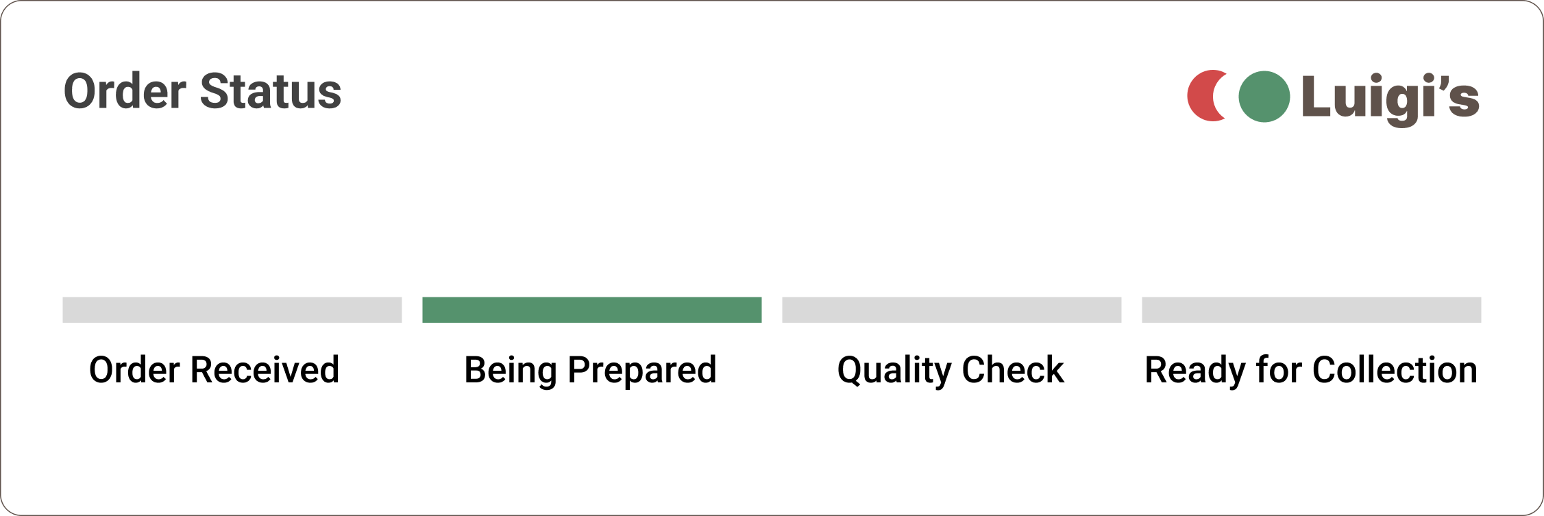
Design Update |
Order Status
To keep users aware of the status of their orders, I created notifications with live updates. I extended this to the app in case users had it open for any other reasons.
Learnings
The Takeaways |
What I learned throughout this project is that many of the assumptions, preferences, and opinions we hold as designers aren’t necessarily the obvious choices for those we design for. We are designing for users and despite our best intentions, perception and interaction belongs to them. It’s our job to simply facilitate.
It’s also not how much we put into the design, but how much we take away while still retaining integrity, relevancy, and utility. Everything must be purposeful.
I realised the importance of accessibility. Our biases and personal abilities should never interfere when designing for inclusiveness.
More importantly, the design journey does not end. It remains in a constant state of iteration.
-
One of the things I neglected to address was input methods other than touch.
The reliance on touch alone would isolate users with disabilities, particularly motor skills or visual impairment.
-
In hindsight, I should have paid more attention to component creation, variants, states, and naming conventions.
By not maintaining strict adherence to best practices I caused unnecessary personal workflow delays, orphaning some components, and duplicating others.
-
I should have run contrast testing early on when building the brand palette.
The original green I selected for the app had a low contrast ratio when CTA text was added.
-
I should have ensured that the interaction points in designs during wire-framing adhered to best practices.
My initial designs included clickable areas in very close proximity to each other which would have led to false clicks and eventually user frustration.
This became apparent when I shifted from paper to digital wire-frames and tested them on my mobile device.
Feature Experiments
Group Orders |
A single order for a group
Often, college students, interns, and executive assistants stop by Luigi’s to pick up an order for a group of people waiting impatiently in a dorm room or conference room somewhere.
The ordering process is a hilarious blend of coordination via multiple phone calls, text messages, and group chats with members chiming in with their requests, often topped by flip-flop decision making.
Things become convoluted as the order is then narrated to a staffer who relies on good listening, sound understanding, and finally, human memory to enter it in the system. End-user satisfaction is questionable at the end of this ordeal.
With this in mind, I introduced the concept of a group order - where multiple users, with app access, could browse, customise, and place orders individually from the comfort of their own devices, leaving the designated member to submit the unified order for payment and/or collection.
Auto-Orders |
Order plans for efficiency and convenience
Routine decisions can be non-productive. The fewer choices you have to make, the more time and energy you have for more important decisions.
To our personas in this project, time is a scare commodity. Routine didn’t allow room for flexibility. The perception of time lost in having to park, stand in line, order, and wait proved inefficient to them. But, this also means a loss of business opportunity for Luigi’s.
The idea of an auto-order could relieve a lot of unnecessary stress and also save time. It takes a few minutes to create an itemised list, set a specified time and date/s for pick-up, and checkout. All items will be prepared just-in-time and made available for collection.
Auto-orders need to be paid upfront. They are discounted with other free-of-charge items (FOCs) thrown in from time to time. An incentivised program could be beneficial to those who are loyal, a decent count by Luigi’s estimates.
In floating this concept, I’ve restricted Auto-Orders to a week as a time.